The short version
SEQ-16 is a browser-based drum machine and production tool built around a simple idea:
Get from musical idea to usable loop without leaving the browser.
It combines a 16-track step sequencer with AI-generated variations, real-time sample shaping, pattern chaining, a large vintage drum-machine sample archive, a dual-deck slicer, and WAV/MIDI export.
The product is deliberately dense. On a desktop, that density gives a musician simultaneous access to the state of the instrument. On a phone, the same density becomes the central UX problem.
The most important design question became:
How do you preserve the spatial logic of a musical instrument when the screen suddenly becomes much smaller?
I came to think of this as a recompaction problem, not a responsive-design problem.
01The problem wasn't making it responsive
A 16-step sequencer has a useful spatial grammar.
Tracks run vertically.
Time runs horizontally.
The relationship between the two makes the pattern readable.
A musician can look at the grid and immediately understand where the kick lands, how the hats relate to it, and where the pattern becomes more or less dense.
That relationship is also what breaks first on a phone.
The obvious solution was to make the desktop layout responsive: reduce widths, wrap controls, let the grid shrink.
That technically works.
It just doesn't work very well.
A 16-column grid that becomes 16 tiny columns on a phone preserves the layout while destroying the interaction. Touch targets become difficult to hit, the pattern becomes harder to scan, and the very spatial relationship that makes the sequencer useful starts disappearing.
So I reframed the problem:
Don't make the desktop interface smaller. Decide what the musician needs at each moment, and rebuild the access pattern around that.
That distinction shaped almost every mobile decision that followed.
02Density is not the enemy
One of the first things I had to resist was the instinct to make the interface feel "cleaner" by removing information.
SEQ-16 is a musical instrument, not a content site.
A hardware drum machine can be dense because the user benefits from seeing its state simultaneously. The position of a control has meaning, and the sequencer, sound controls and transport form one spatial model.
I wanted the desktop version of SEQ-16 to preserve that quality.
The design question wasn't:
"How can I show less?"
It was:
"Which information is worth keeping visible because removing it would increase context-switching?"
That became an important principle for the entire product.
03Designing the desktop cockpit
The desktop interface uses a three-column model inspired more by a hardware console than a conventional responsive web application.
The left side is about getting the kit and sounds into place.
The center is about global sound and mix shaping.
The right side is about pattern management, AI generation and output.
The goal wasn't to imitate hardware visually for nostalgia. I borrowed the hardware mental model because it supports a particular way of working:
The instrument remains visible while you work.
You don't have to repeatedly leave the pattern to change the context in which you're hearing it.
Within each instrument row, sequencing and sound shaping also stay together. The grid provides the rhythmic state; the track controls provide immediate access to volume, pan, pitch and decay/tone.
The result is intentionally information-rich.
It gives an experienced user a cockpit rather than a sequence of screens.
But density needs an escape hatch
A musician working deeply on a pattern doesn't always need the entire cockpit.
The master controls can collapse when the user wants more room for the sequencer, while essential global controls remain within reach.
This creates two useful modes:
Cockpit mode — broad context and access to everything.
Pattern mode — maximum space for the thing currently being edited.
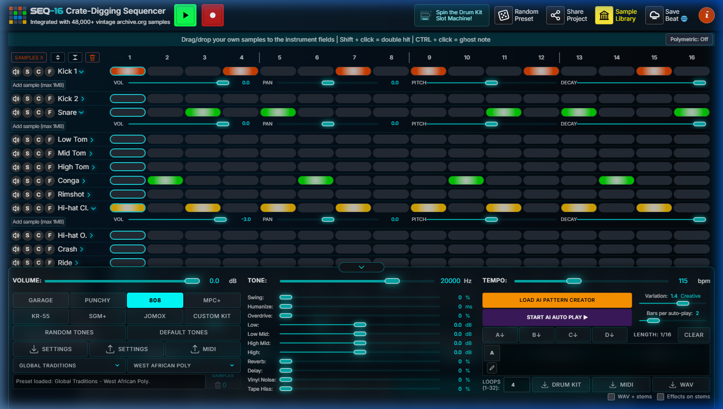
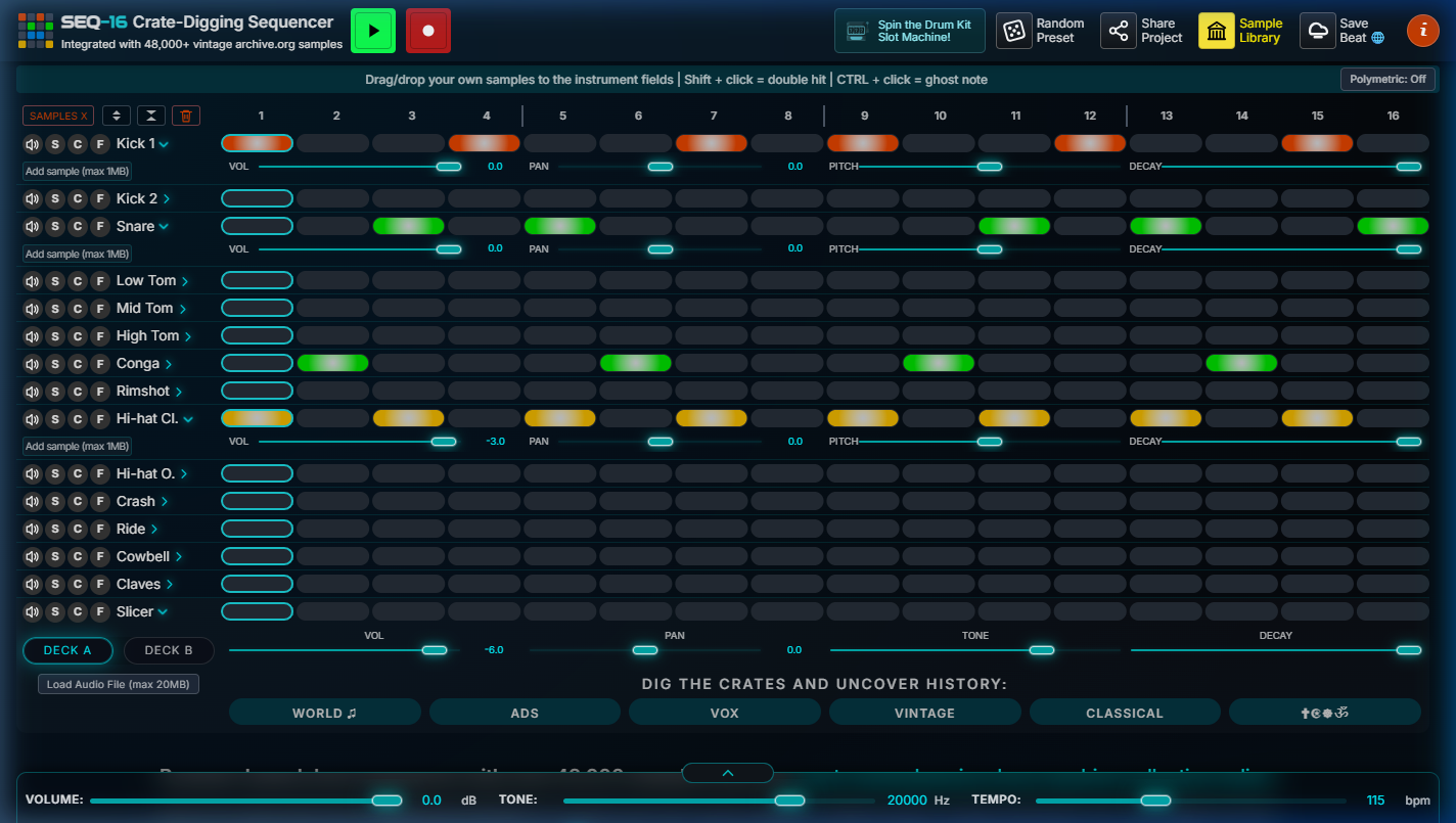
I wanted the transition between those modes to feel like changing the physical configuration of an instrument, not navigating to another application state.
04Recompacting the cockpit for mobile
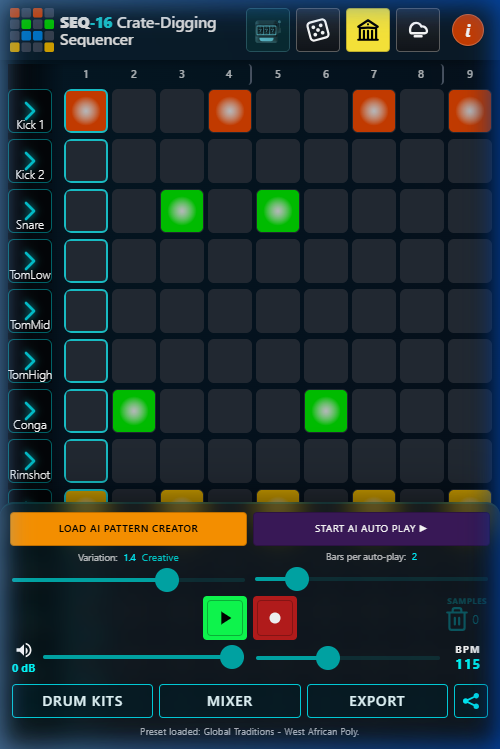
Below the mobile breakpoint, the desktop three-column cockpit disappears.
But I didn't create a second mobile implementation of the product.
Instead, the same functionality is reorganized into contextual destinations:
Drum Kits · Mixer · Export
The underlying state and behavior remain shared; what changes is how the user reaches the functionality.
This distinction mattered.
A separate mobile implementation would have meant maintaining two versions of the same workflows and potentially creating subtle differences in behavior between them.
The mobile interface therefore isn't a reduced version of SEQ-16.
It is a different access pattern to the same instrument.
What deserves permanent space?
Recompaction forced a more difficult question:
Which controls are important enough that I should never make the musician go looking for them?
I ended up keeping three categories in persistent mobile chrome:
Transport
Play/pause and live recording remain immediately available.
A drum machine shouldn't make the user navigate just to hear the result.
Master controls
Volume and BPM stay within immediate reach because they affect the entire musical context.
AI generation
This one took an iteration.
Initially, AI generation lived inside the Export drawer with other less-frequently-used functions.
Technically that was tidy.
UX-wise, it was wrong.
"Generate Variation" is one of the product's most distinctive actions. Requiring a drawer interaction before every generation interrupted the very loop the feature was intended to accelerate:
hear → change → generate → hear again
So I promoted it into persistent mobile chrome.
That was a useful reminder that information architecture should follow frequency and importance, not conceptual categorization alone.
05The grid was the real mobile problem
The sequencer itself presented the hardest constraint.
On desktop, all 16 steps can sit comfortably on screen.
On a phone, comfortable touch targets consume most of the available width.
I chose not to compromise touch-target size simply to preserve the visual illusion of a complete 16-step grid.
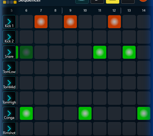
Instead, the mobile grid becomes horizontally scrollable.
The user sees a smaller window into the same sequence.
Why not simply use mandatory snapping?
I experimented with the behavior of the horizontal viewport and found an important distinction between alignment and control.
Hard snapping made small exploratory movements feel like the interface was taking control away from the user.
So the grid uses proximity snapping rather than mandatory snapping.
The viewport tends to settle into useful positions without forcing every small movement into a predefined state.
During playback, the grid can follow the playhead in eight-step blocks so the active region stays visible.
But that introduces another potential conflict:
What happens if the user is manually exploring the grid while playback is running?
The answer was to temporarily suspend automatic following after a manual touch.
Playback continues underneath.
The user's direct manipulation wins.
This is a small interaction rule, but it reflects a broader principle:
Automation should yield when the user is actively expressing intent.
06When a tap becomes a swipe
The most difficult mobile problem wasn't visual.
It was deciding whether a finger gesture meant:
"Toggle this step."
or:
"Move across the sequence."
My first implementation tried to solve the problem by taking control of the touch interaction.
Pointer-down immediately captured the gesture and prevented the browser's default behavior.
It made individual taps reliable.
It also made horizontal scrolling effectively impossible.
Dragging across the grid to reach steps 9–16 caused the finger to toggle every pad it passed over.
The implementation was technically decisive.
The interaction was wrong.
The solution was to delay commitment
Instead of deciding what the gesture means when the finger goes down, the interface waits for more evidence.
A touch begins as a potential tap.
If the finger lifts on the same step it started on:
commit the tap.
If it moves to another step:
treat it as navigation.
This allowed native browser scrolling to remain in control of the horizontal gesture while preserving reliable step selection.
The rule became remarkably simple:
Start on a pad and finish on that pad: toggle it.
Move away: scroll instead.
I then extended the same model to expressive gestures:
- Long press: ghost note
- Double tap: double hit / flam
Those gestures use the original press position rather than the release position, so small finger drift doesn't move the action onto a neighboring pad.
This was one of the clearest moments in the project where a UX problem became simpler once I stopped trying to outsmart the platform.
I didn't need a more sophisticated gesture recognizer.
I needed a better definition of when intent had actually been expressed.
07Keep the musician in context
Desktop can keep per-track controls beside the sequencer.
Mobile cannot do that without consuming too much of the screen.
On mobile, Volume, Pan, Pitch and Decay/Tone become contextual controls attached to the selected instrument. Tapping the instrument label opens a bottom sheet.
The important decision was that the sheet is non-blocking.
The musician can continue interacting with the sequencer behind it.
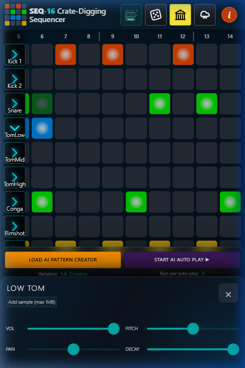
A conventional modal says:
"Finish this task before returning to the thing underneath."
That model doesn't fit music-making.
The relationship between the parameter and the pattern being heard is the context.
So the interaction instead says:
Change the sound without leaving the musical context.
I also removed numeric value inputs from this mobile view in favor of larger sliders.
This sacrifices precision.
That was intentional.
On desktop, precise numeric manipulation is reasonable because there is enough space to accommodate it without compromising the rest of the interface. On a phone, preserving the same precision would add interaction cost disproportionate to its value.
The mobile interface therefore optimizes for:
fast adjustment over exact entry.
08Progressive disclosure without losing capability
The overall mobile strategy can be summarized as:
| Access level | Controls |
|---|---|
| Persistent | Transport · BPM · Volume · AI |
| Contextual | Volume · Pan · Pitch · Decay/Tone |
| Drawer-based | Kits · Mixer · Export |
| Desktop-focused | Advanced slicing |
This wasn't about hiding functionality.
It was about controlling how much of the instrument competes for attention at any given moment.
The user still has access to the product's deeper capabilities; the interface simply stops asking them to carry the entire instrument in their head at once.
09Knowing what not to bring to mobile
Not every desktop interaction deserved a mobile equivalent.
The clearest example is the dual-deck Slicer.
The Slicer is designed around manipulating longer audio sources, navigating waveforms, selecting regions, dragging slices into instrument rows and working with comparatively large audio files.
Trying to reproduce that interaction on a phone created several problems at once:
- waveform manipulation requires precision;
- edge dragging and scrolling compete for the same gesture space;
- drag-and-drop has no clean equivalent on a small touch surface;
- larger audio files introduce additional memory and performance pressure.
Rather than ship a compromised version simply for feature parity, I explicitly excluded the Slicer from mobile and surfaced that limitation in the interface.
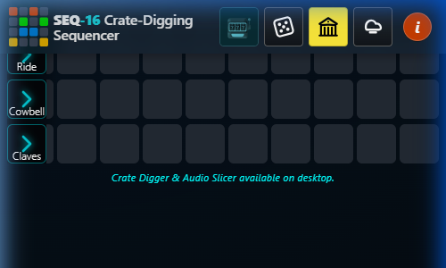
That was an intentional product decision:
A feature is not automatically better because it exists everywhere.
Sometimes the better mobile UX is an honest boundary.
10The difference between an intentional cut and an accidental one
The Slicer was a deliberate exclusion.
Other desktop capabilities were not.
Mute, Solo, Clear, Fill, Clear All and Expand/Collapse All became inaccessible on mobile as a side effect of broader layout decisions—particularly the removal of the desktop title/instruction area where several of those actions lived.
That distinction matters.
There is a meaningful difference between:
"We decided this isn't important enough for mobile."
and:
"This disappeared because another design decision accidentally took it with it."
The latter is design debt, not product strategy.
I wouldn't hide that in a case study.
In fact, it is one of the more useful lessons from the project:
Responsive simplification can create invisible feature loss.
When an entire visual region disappears, everything attached to that region needs to be audited independently.
11Designing AI as part of the instrument
AI introduced a different UX question:
How do you add generative behavior to an instrument without making the musician feel like they're handing control over to a black box?
I treated AI-generated patterns as another starting point, not a separate destination.
A generated variation lands in the same editable sequencer representation as a manually created pattern.
The workflow is:
Seed → Generate → Hear → Edit → Humanize → Keep or reject
rather than:
Prompt → AI result → new mode
That distinction is important.
The AI doesn't replace the sequencer.
It feeds the sequencer.
A generated pattern becomes just another editable state of the instrument. The musician can immediately change individual steps, adjust the sound, alter timing or throw the variation away.
That preserves the musician's sense of authorship.
The principle is:
Use AI to increase the number of ideas you can explore, not to reduce the amount of control you have over the result.
12The product loop
Taken together, these decisions produced a simple underlying interaction model:
Create
Start from a kit, an existing pattern, a saved project, a custom sample or an AI-generated variation.
Sculpt
Edit individual steps and shape each sound with pitch, decay/tone, volume and pan.
Arrange
Use pattern banks and chaining to move beyond a single loop and build sections.
Export
Render WAV, stems or MIDI and move the result into a larger production workflow.
The interface is essentially a series of ways to keep that loop moving.
Whenever I introduced a feature, the useful question became:
Does this help the user move forward, or does it create another place they have to learn?
That became a more useful constraint than simply trying to minimize the number of controls.
13What I'd change now
SEQ-16 is a living product, so there are several things I would revisit.
Make feature loss explicit
I would deliberately bring Mute, Solo and Fill back into the mobile experience rather than allowing them to remain accidental casualties of the layout.
Their absence should be the result of a conscious prioritization decision, not a side effect.
Finish polymetric mode properly
The underlying mechanism exists, but the mobile experience currently doesn't expose it.
I'd either complete the interaction or explicitly decide that polymetric editing belongs to a larger-screen workflow.
Temporary states have a habit of becoming permanent, so I would rather make that decision explicit.
Explore a lighter mobile Slicer
I still wouldn't reproduce the full desktop Slicer on a phone.
But a read-only preview or simplified slice-selection experience could potentially let users discover material on mobile and defer precision editing to desktop.
That would preserve the intent of the feature without forcing the entire desktop interaction onto a smaller surface.
Revisit the first minute
As the product has accumulated capabilities, the UX risk has shifted.
The challenge is no longer simply whether SEQ-16 can do something.
It's whether a first-time user understands what to do next.
If I continued the project, I'd invest less in adding capability and more in making the first 60 seconds exceptionally clear.
14Takeaway
The biggest lesson from SEQ-16 wasn't about breakpoints.
It was about preserving intent while changing the way an interface is accessed.
Responsive design asks:
"How does this layout fit a smaller screen?"
Recompaction asks:
"What is the user actually trying to do here, and what is the smallest interface that preserves that task?"
That distinction led to almost every major mobile decision:
- keeping transport persistent;
- promoting AI generation into permanent access;
- moving secondary controls into contextual sheets;
- allowing the grid to scroll rather than shrinking its touch targets;
- letting native scrolling win over aggressive gesture capture;
- temporarily yielding automated playhead movement to direct manipulation;
- excluding the Slicer rather than shipping a compromised version;
- and identifying which missing controls were intentional versus accidental.
The most useful interaction rule came from the hardest problem:
Don't capture a gesture just because you can. Wait until the user's intent is clear.
That's a principle I can carry into any interface I design:
Preserve context, make intent easy to express, and let complexity recede until it is actually needed.